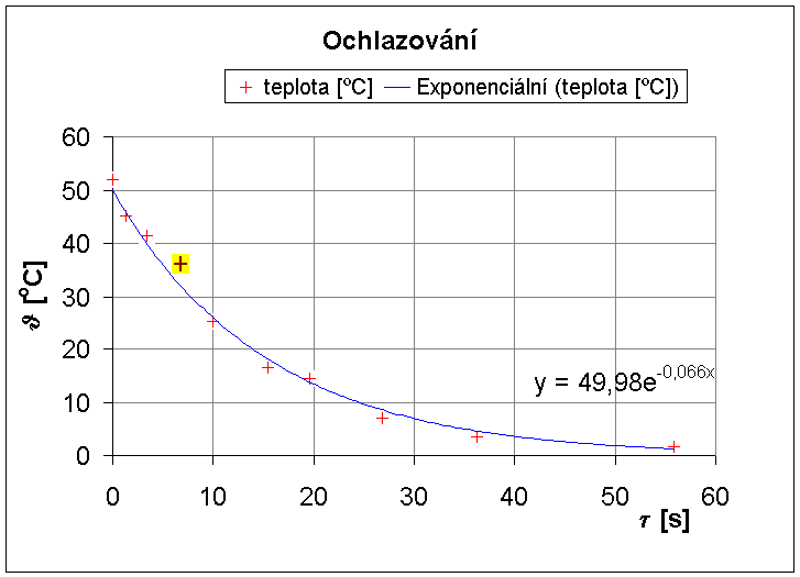
The MS Excel, task 1, proposition
- Get the data from
the external
page
(Czech only, a temperature measurement while
cooling) and draw the X-Y graph (scatter). Other
instructions:
- check the correct
graph (X-Y, markers only).
- insert as an object
to actual sheet, expand it to be as big as
possible.
- marker type should
be a cross (+); before choosing the size (7 to 10
points) and type, choose the color (e.g. blue)
and background (e.g. white, but different).
- add the trend line.
Correct is the exponential. Show the trend line
equation.
- choose a single
point (some interesting one) and change its color
and the background color (e.g. red and yellow).
- set the axes titles,
including units (degrees of Centigrade and
seconds).
- use greek letters
for names of axes (see the picture at the end of
this page).
- check both
(horizontal and vertical) gridlines are visible,
thin and grey. Horizontal grid per 10 °C.
- Get the data
from the same external page (will generate
different values) and add another data series to
the same graph (two cooling processes in one
graph).
- Get the data from a
text file, specidied in the following list. Other
instructions:
- convert to two
columns in Excel..
- draw the both lines
to one graph.
Depending on the last number of your student's ID (CTU
ISIC card ID), select the correct two files from the
table:
Solution of the first task
from the Czech course: